After a raaaather long absence (for which I am very sorry indeed), I have at last revived the blog!
I hope this post finds you all well! I, for one, have been busy doing all sorts of stuff... which has meant a bit of a hiatus from the internet.
BUT I am very happy to return to it.. of darling internet, place of wonder and excitement! How could I have neglected you so?
I'm opening this new phase of blogging with a little post inspired by one of my new favourite blogs Miss Moss. She does some rather lovely colour comparisons of fashion images and paintings, so I thought I'd try my hand at it (it's actually harder than you would imagine!).
Despite being a bit underwhelmed by the Spring 2012 collections, I sifted through the detail images to come up with some of what I think are the more interesting design details this season. I am always a fan of Erdem's spidery lace and cool colour mixes, while Jil Sander intrigued me with sequined paisleys and those funny little hats, which seem like some kind of modern hybrid of veil and hipster tuque...
I loved the understated blush palette of Tisci at Givenchy (neutral! my favourite colour!), and Philo at Céline is always a blockbuster of killer new proportions. Burton's spin on underwater creatures at McQueen was dark and airy like a ghost (and a bit creepy too), and the boys at Proenza turned 50's kitchen appliance colours into coolgirl neutrals...
Next to some of Edmund Charles Tarbell's romantic paintings of excessively feminine beauties, these looks take on a nostalgic charm in a way...
What do you think?
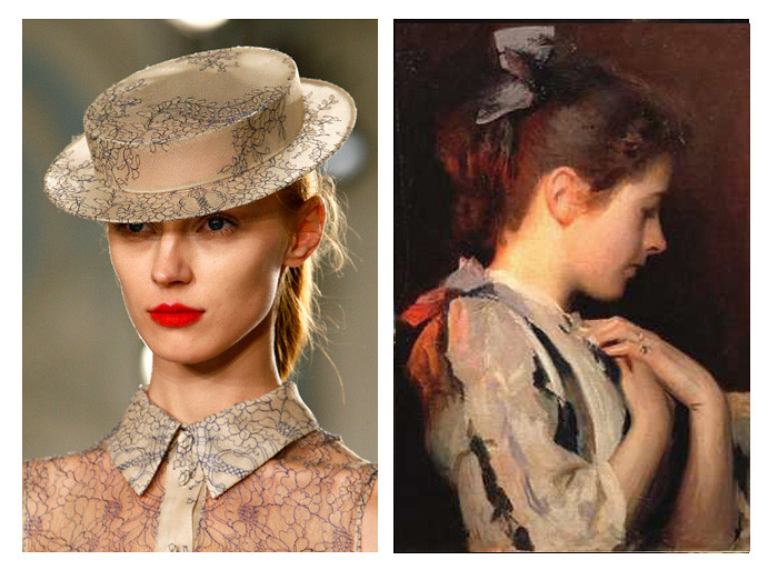
Erdem
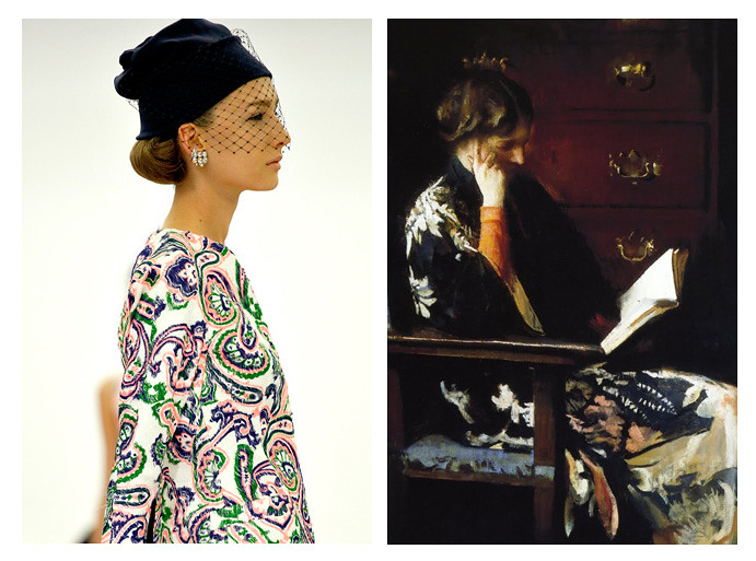
Jil Sander
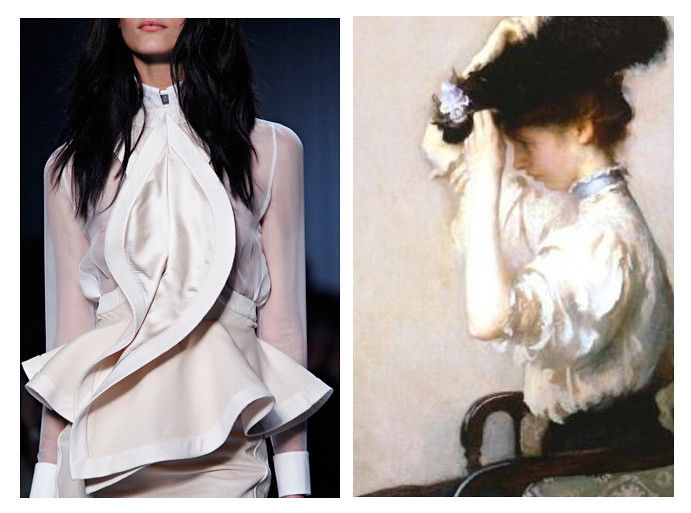
Givenchy
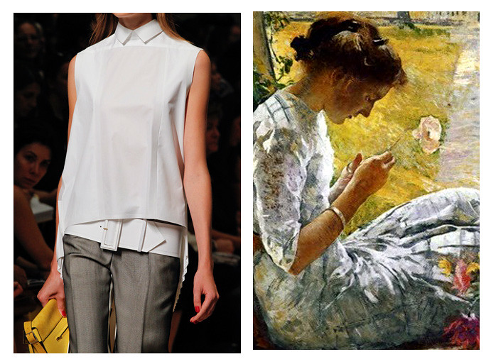
Céline
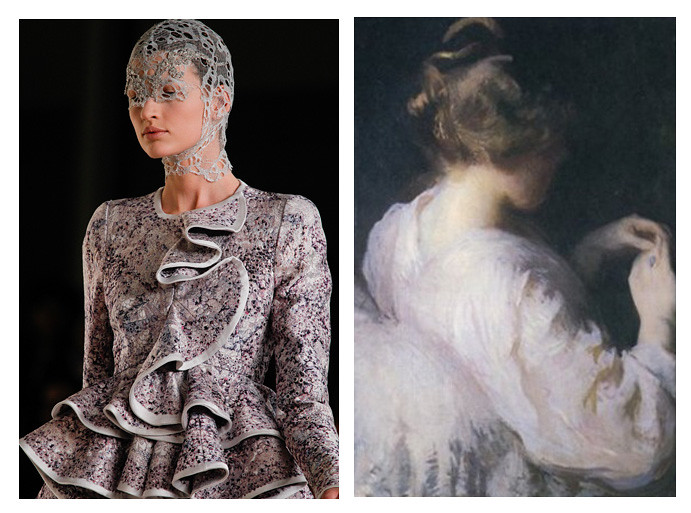
Alexander McQueen
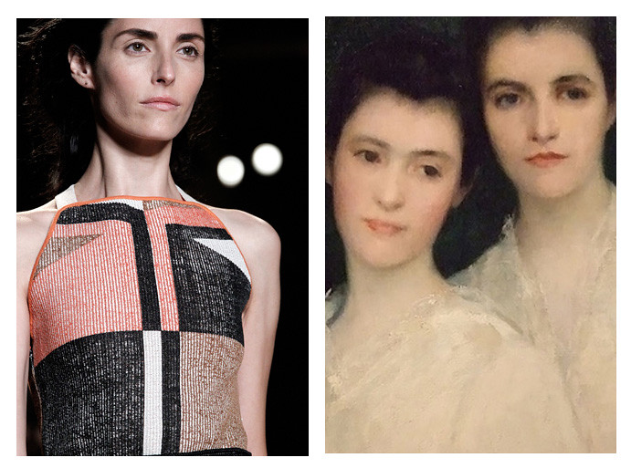
Proenza Schouler

nice to have you back lovely! hope school is going well for you!
ReplyDelete